brief
having grown rapidly, chalkline ltd needed a more professional and stylised logo to represent the brand. Amongst a number of requirements, the client was very specific that they didn’t want a predictable cloud design but at the same time it needed to represent the industry they worked in.
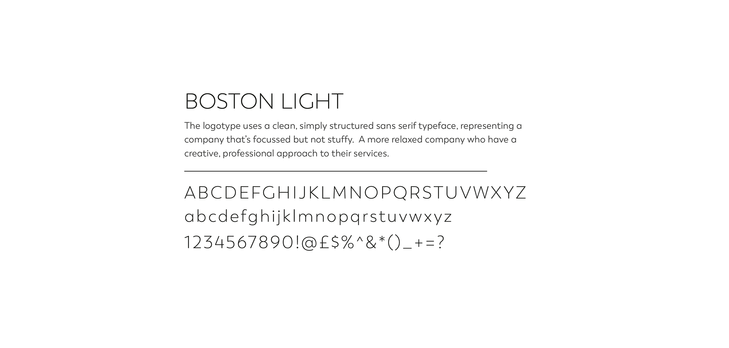
With this in mind, we developed an icon that was a play on the letter C and was a subtle nod to a cloud but also reiterating the fact that the company helps their clients in a positive way. This was complimented with a modern sans serif font for the brand name.


