brief
we were approached by the founders of Rootz to create a unique logo and icon that could be used effectively across both digital and print. the client wanted something that was elegant, traditional and premium.
electric design studio ran a workshop with the client and through extensive research, a script serif font was chosen for the logotype which was adapted and enhanced to bring in a sense of old style traditional elegance. the logo mark retains the same style with the added floral element swish as a way of creating a unique icon that can comfortably be used on its own or alongside the logotype.
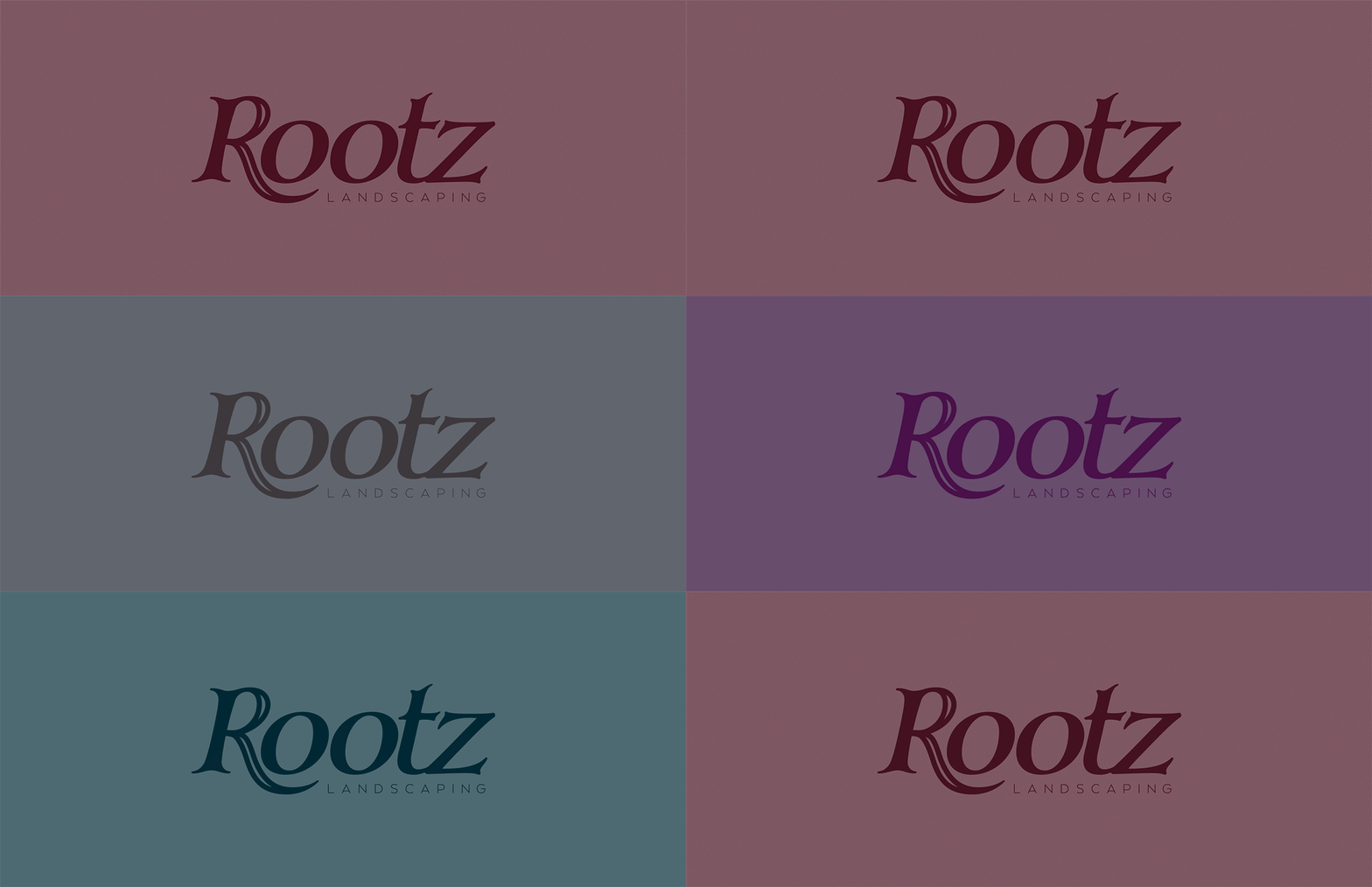
alongside the brand colour, the client requested additional colour options which could be used across stationery and marketing collateral.


